Bristol Riverside Theatre
Cover Photo:
Bristol's new business cards
Identity and Brand Redesign
A Bold Identity for a Forward-Thinking Theatre
Bristol Riverside Theatre sought a rebrand that would position them for the future—one that felt fresh, inviting, and inclusive while maintaining the legacy and artistic excellence that define their institution. More than just a new logo, they needed a comprehensive brand system that could evolve with them, encompassing typography, color, and visual elements that would fully capture the theatre experience.
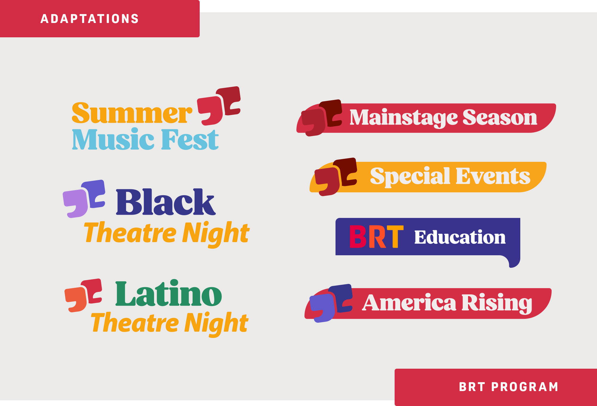
A Scalable, Multi-Tiered Brand System
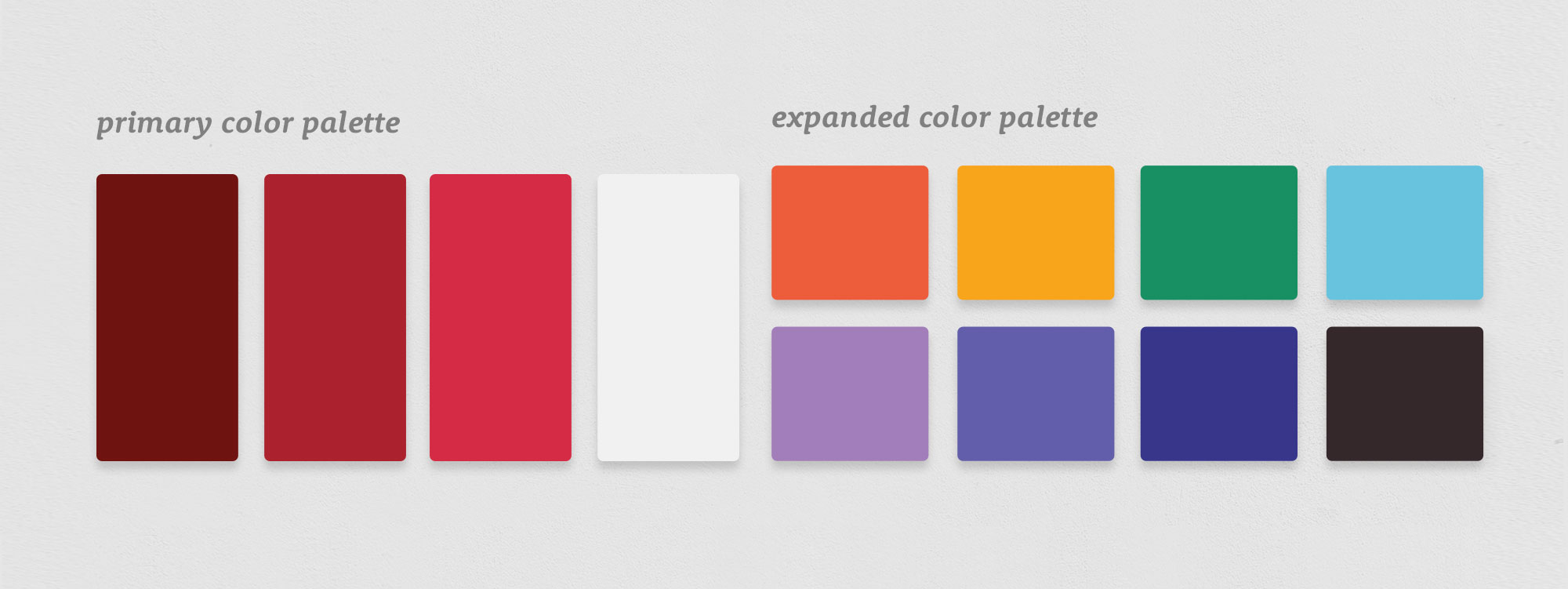
While the theatre’s signature red remains a brand cornerstone, the rebrand introduced a versatile secondary color palette designed for scalability and differentiation. Each color was strategically chosen to give its various programs their own distinct visual presence, allowing them to stand as unique offerings while maintaining cohesion under the larger brand umbrella. This approach not only strengthens brand recognition but also enhances flexibility across marketing and engagement initiatives.
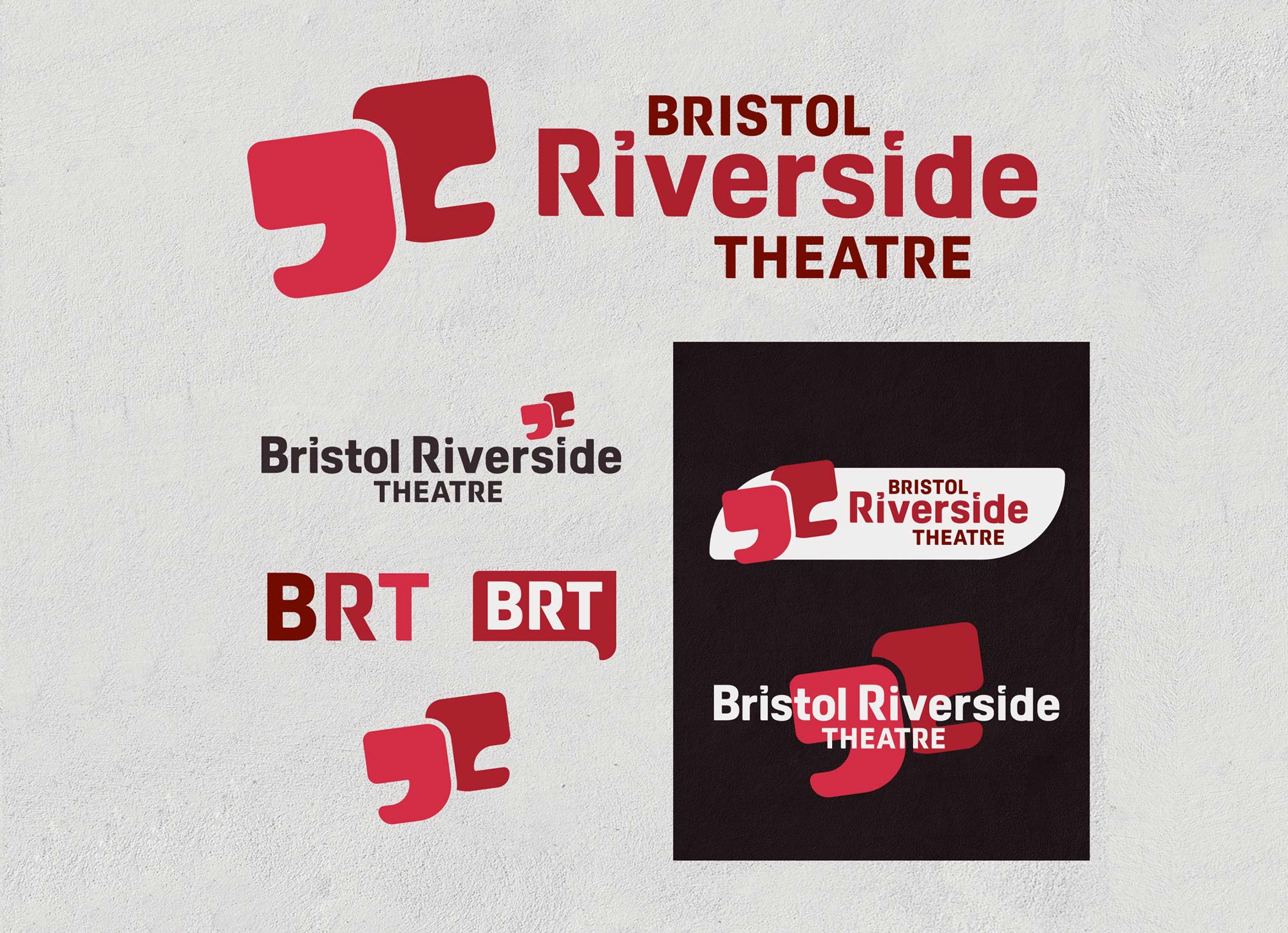
Strategic Design: A Wordmark with Meaning
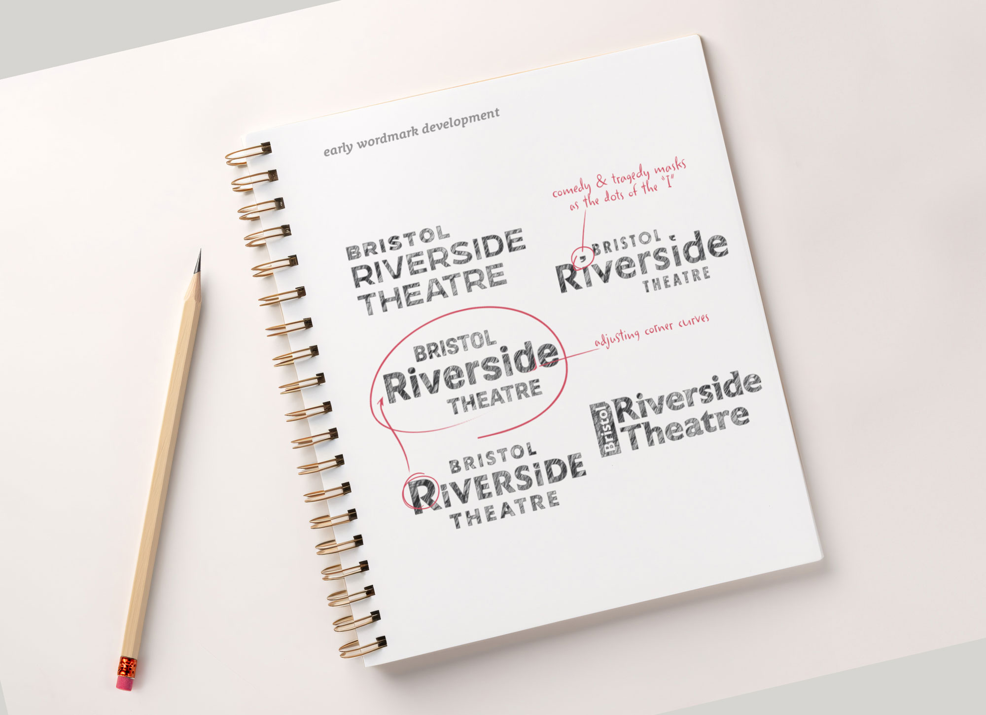
The development of the new wordmark was an intentional, multi-phase process. By carefully integrating elements from multiple concepts, we crafted a final design that balances bold modernity with warmth and approachability. The foundation of the mark was set with a strong, contemporary font, then elevated with custom letterforms, softened edges, and signature design details that make the identity distinct and ownable.
One of the most defining features of the wordmark is the reinvented dot treatment on the “i’s” in “Riverside.” These elements serve as more than just stylistic accents—they function as a standalone brand icon. Inspired by both the classic comedy and tragedy masks and the quotation marks that symbolize conversation and storytelling, these dots reinforce the theatre’s mission: to spark dialogue, connection, and emotion through performance. This concept is further expanded in the brand’s “conversation bubble” motif, a core visual element used throughout its identity system.
This rebrand is more than an aesthetic update—it’s a future-proofed identity that positions the theatre as a leader in the regional arts community. By integrating thoughtful storytelling, modern design principles, and strategic adaptability, this new identity ensures they continue to captivate audiences, foster community engagement, and remain a cultural pillar for years to come.