Mythical Meats x Dungeon's and Dragons
Campaign graphics and package design
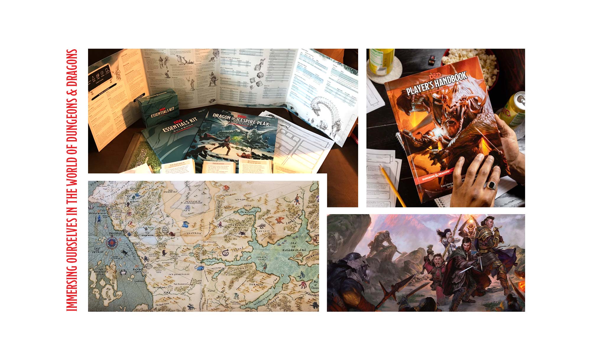
The Call to Adventure
When Dungeons & Dragons approached Mythical Meats, the quest was clear: create a product that honored the D&D universe while expanding Mythical Meats’ reach into new communities. As the creative partner, Kinectiv crafted a brand experience where flavor meets fantasy, an immersive concept extending beyond the packaging into the game. Born from a father-daughter duo’s love of bold snacks and mythical creatures, Mythical Meats has already carved out a unique niche. However, this presented an opportunity to level up, and Kinectiv was ready to move forward.
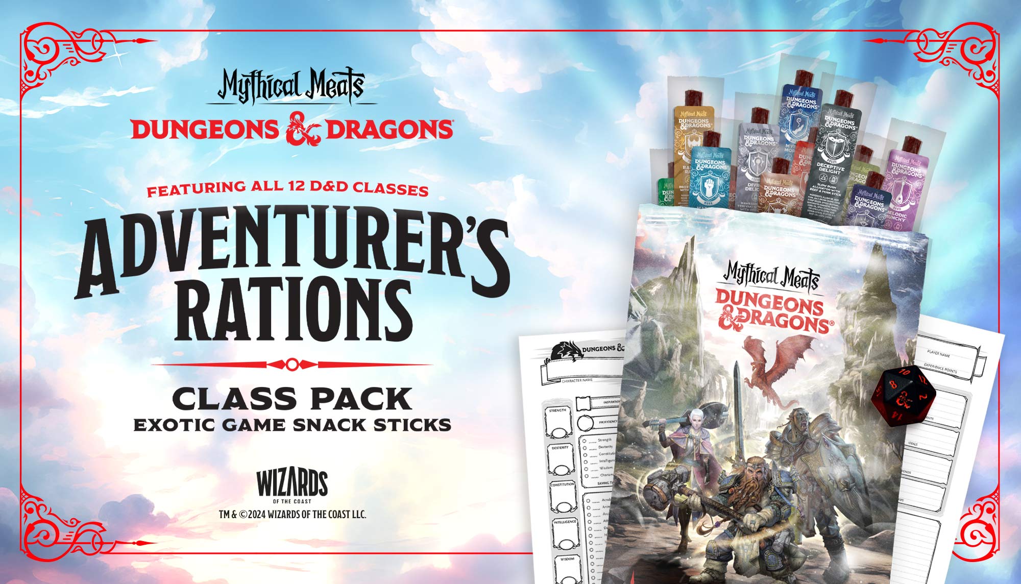
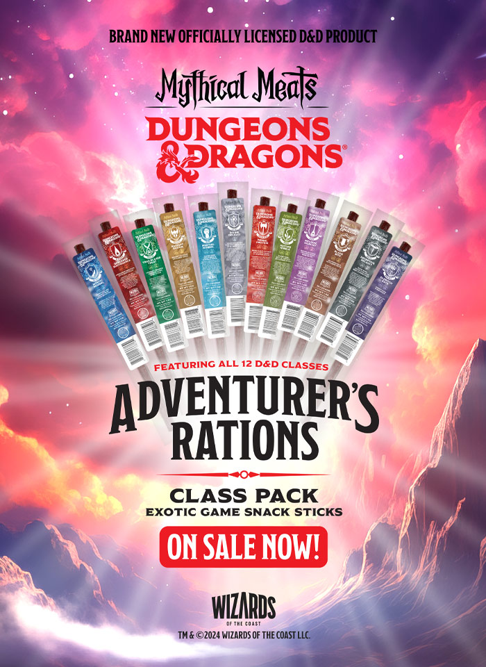
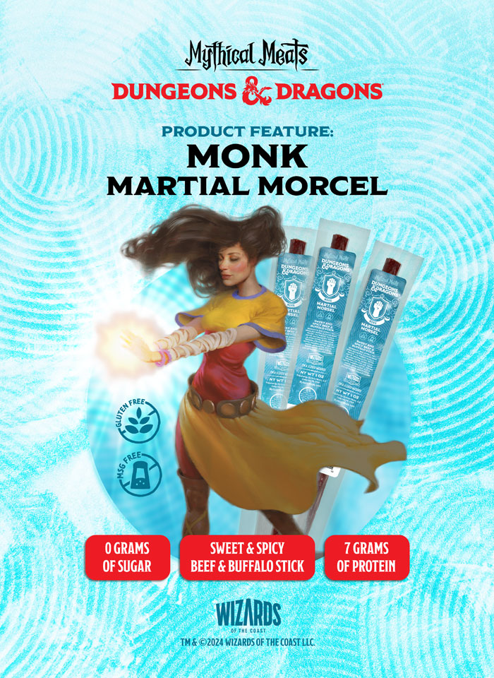
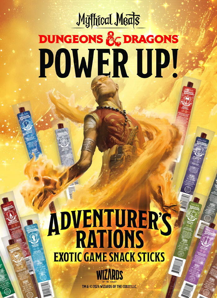
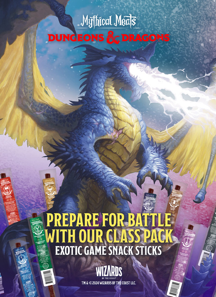
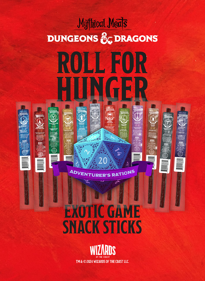
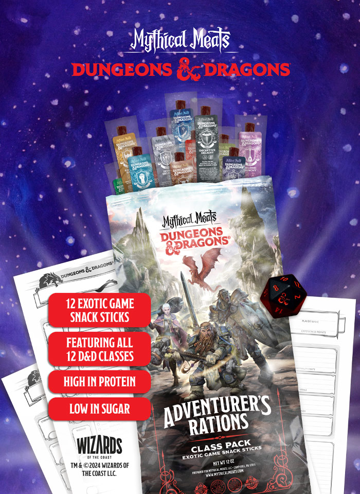
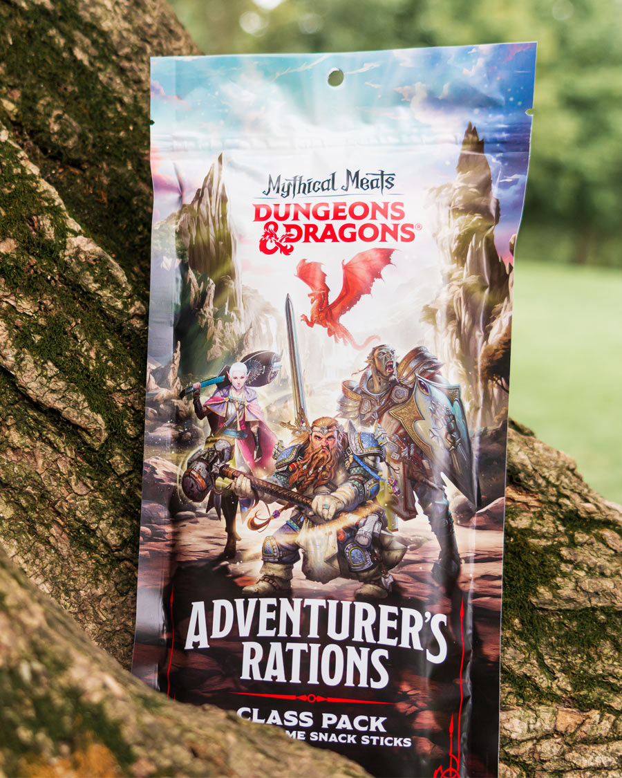
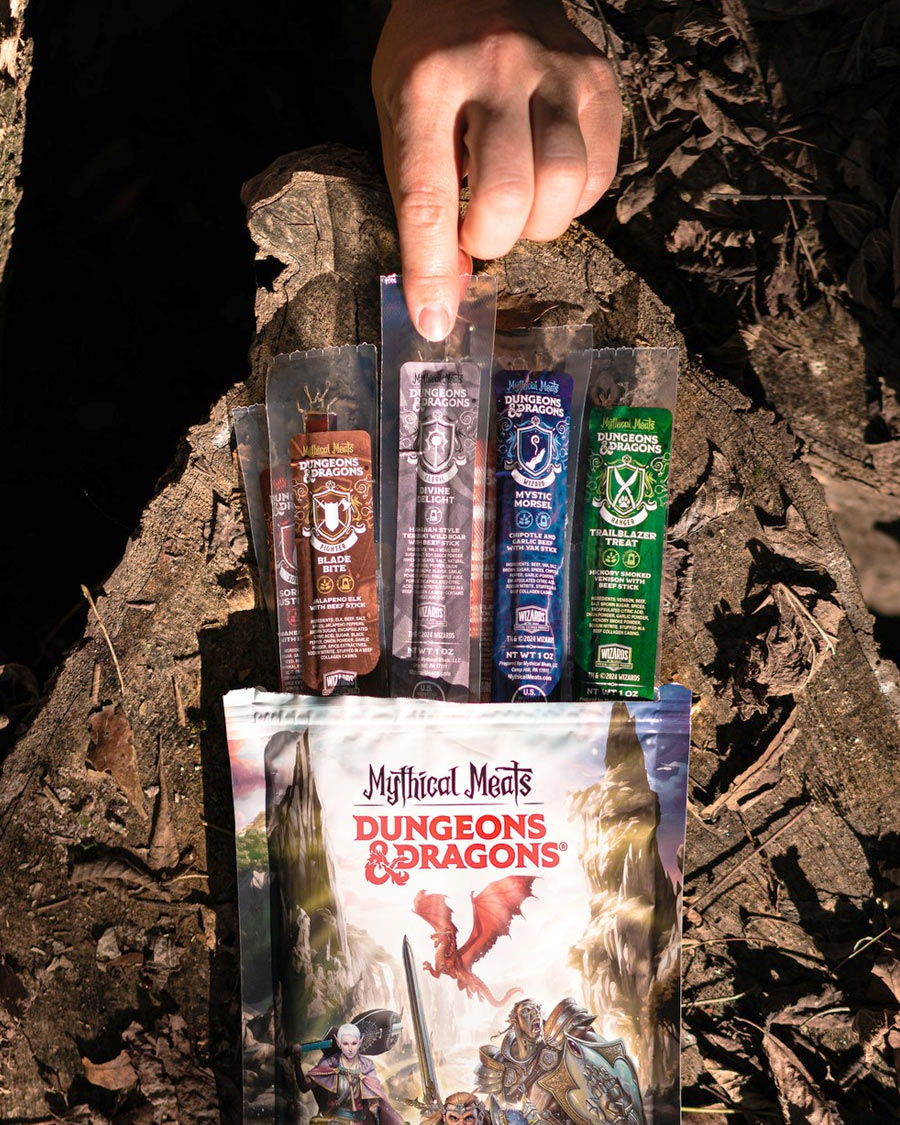
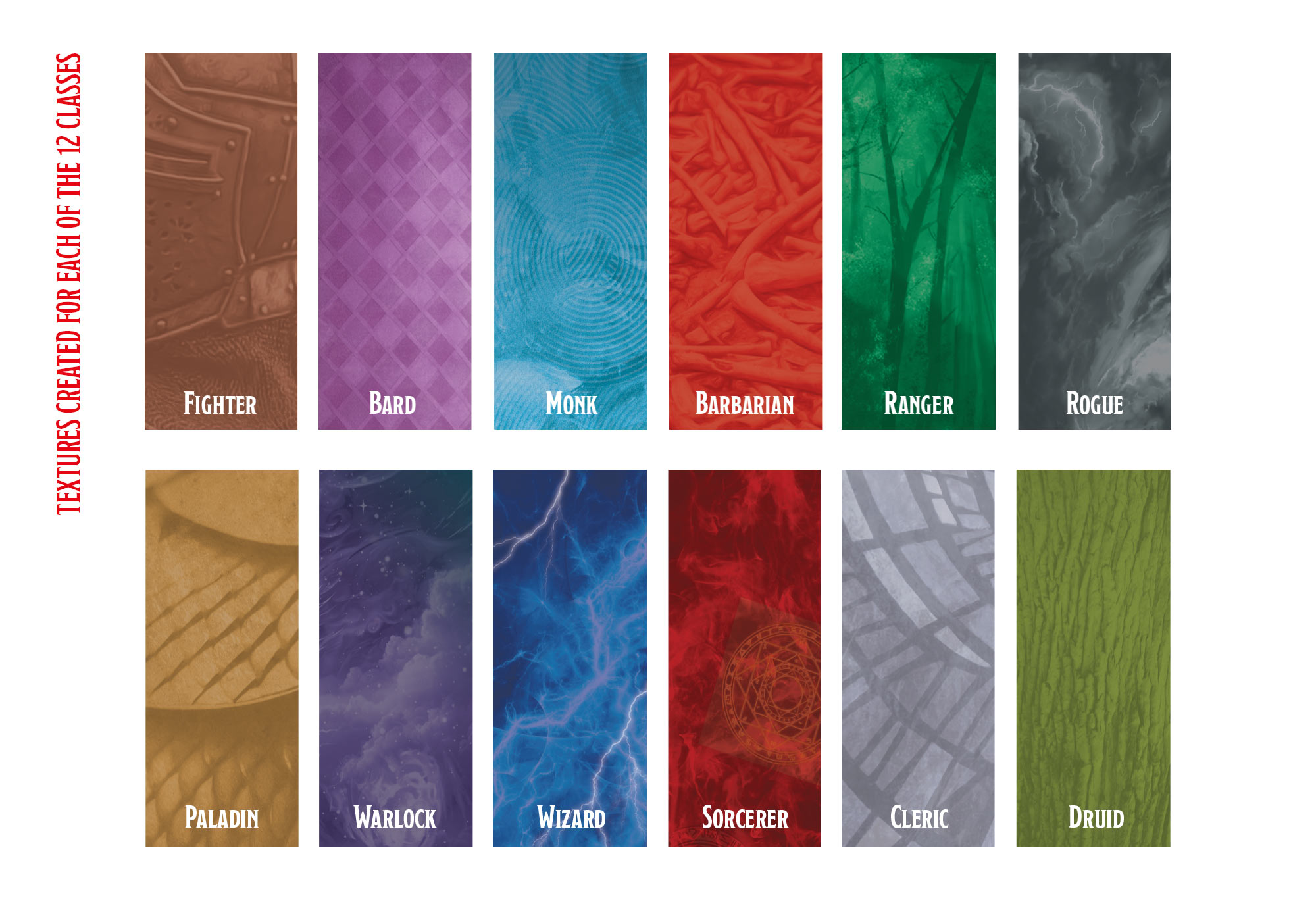
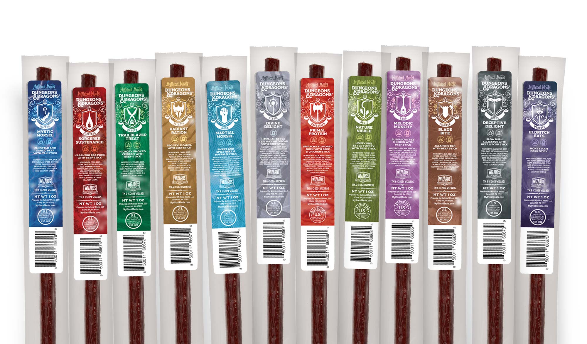
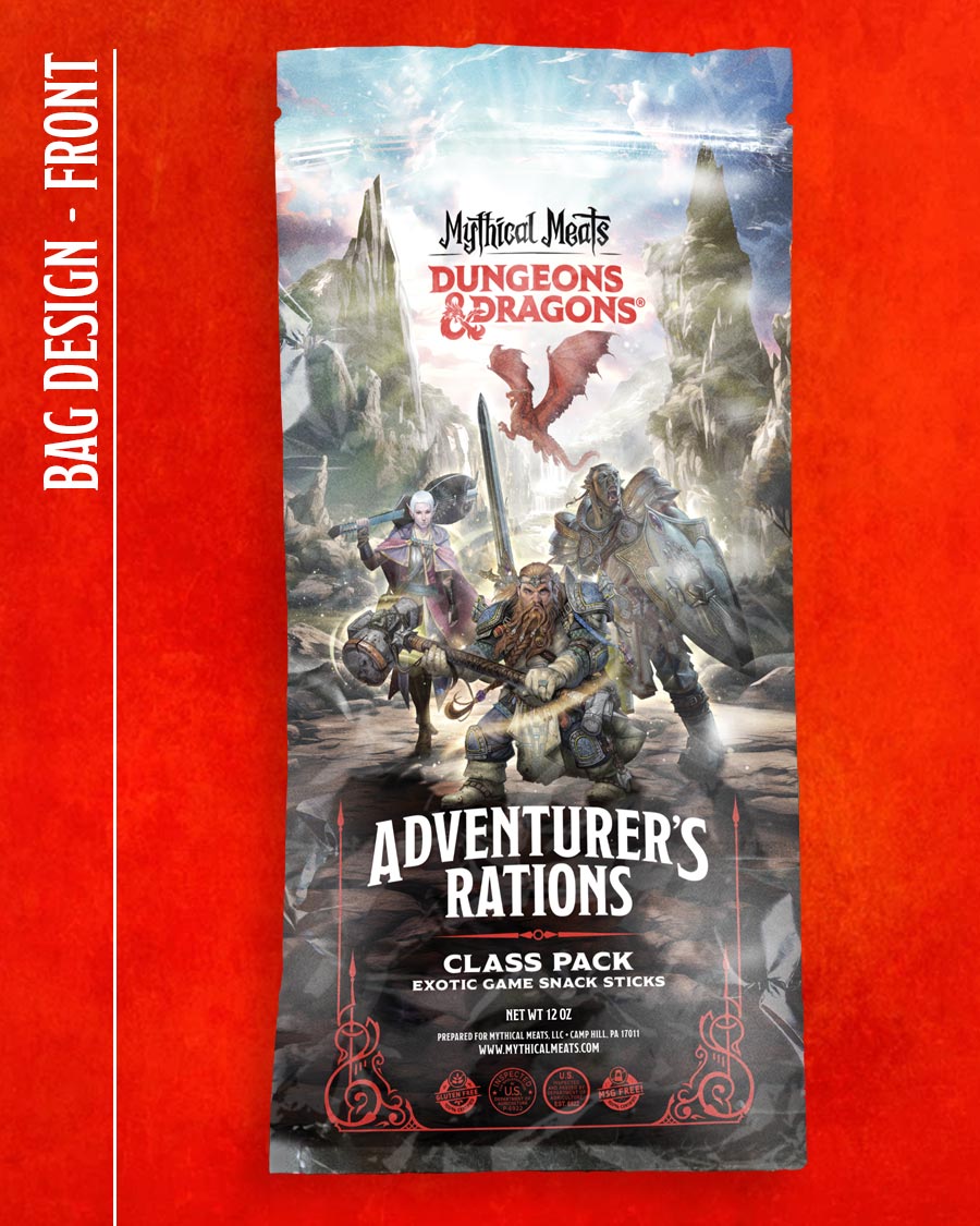
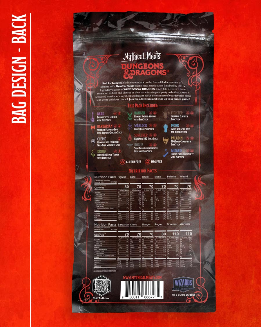
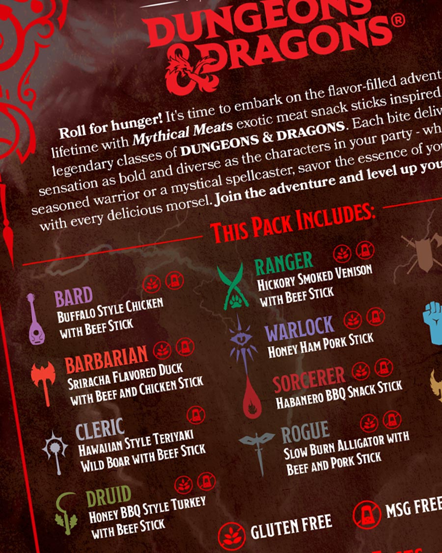
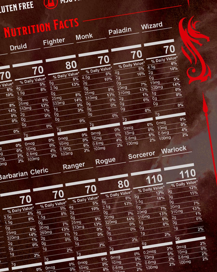
The Class Pack: A twelve-stick collection where each flavor embodied an iconic Dungeons & Dragons Class—from Rogue: Deceptive Delight to Bard: Melodic Munchy. These weren’t just snacks; they were rations, crafted to reflect the essence of each character. Snack sticks featured custom iconography, class emblems, and color coding to signal each class’s identity. The bag served as an entry point, grouping characters into cinematic scenes inspired by D&D lore.
Bringing D&D’s legacy into the Mythical Meats universe came with a few key challenges:
Space: With label real estate smaller than a thumb, every pixel had to earn its place. Alignment: Our designs had to honor D&D’s iconic style while staying true to Mythical Meats. Purpose: The product needed to feel like part of the game: shareable, stashable, and story-driven.
From the first pitch deck to the D&D focus group, the creative process behind the Mythical Meats Class Pack blended research, imagination, and strategy. We explored how flavor could meet fantasy, using early decks to shape tone and design, and focus group feedback to refine the concept. Each step combined worldbuilding with real insights to create a product that felt both authentic and ready for adventure.
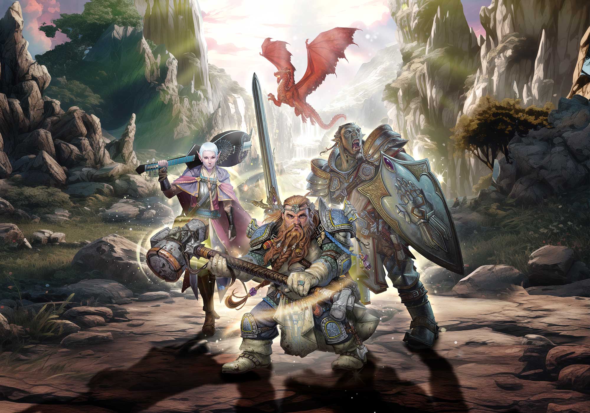
Bag Design: We layered D&D assets with shadows, lighting, and textures, like waterfalls and magic swirls, to create a rich, fantasy backdrop with visual depth.
Snack Stick Design: Each stick featured Class-specific icons, colors, and minimalist elements. Details like armor glints and emblems added texture, while custom filigree tied it all together.
Promo Graphics: Visuals echoed the packaging’s immersive feel, using glowing, scenic backdrops and Class-specific color treatments.
Constraints sharpened our thinking, prompting us to adopt more intentional and strategic design approaches. Cross-team collaboration unlocked richer narratives and a cohesive vision. By fully immersing ourselves in the D&D world, we built an experience that felt real. This campaign embodies our creative philosophy: design with purpose, embrace the challenge, and craft stories that resonate.