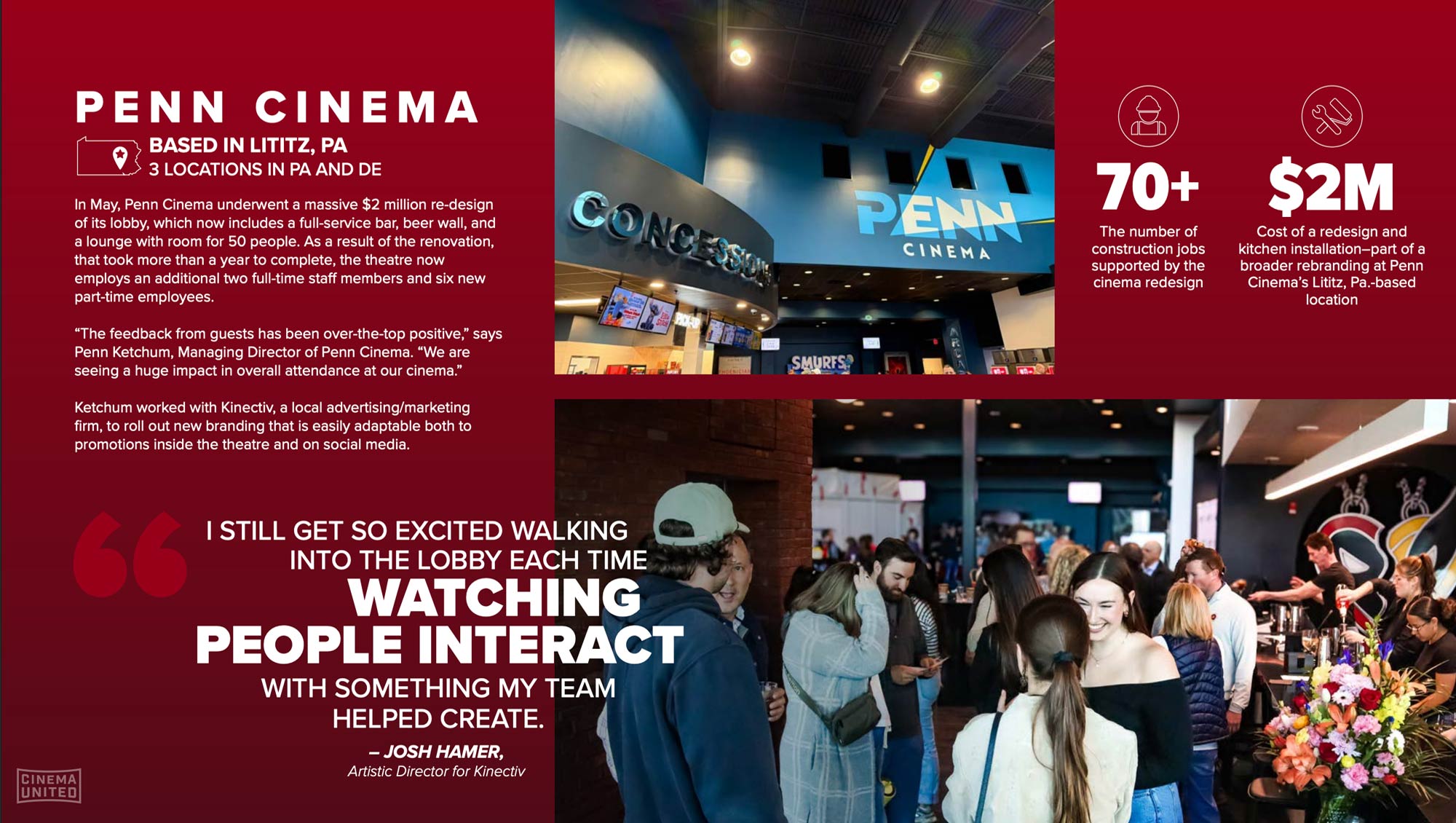
Penn Cinema
Cover Photo:
The brand comes to life—designed to move hearts as well as pixels.
Identity, Branding, Motion Design
More than merch—rebooting a classic
From a merch brief to a brand reboot: we evolved a 20-year-old reel into a projection-based identity that flexes with every film and scales across screens, walls, and tickets.
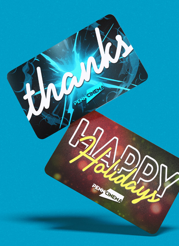
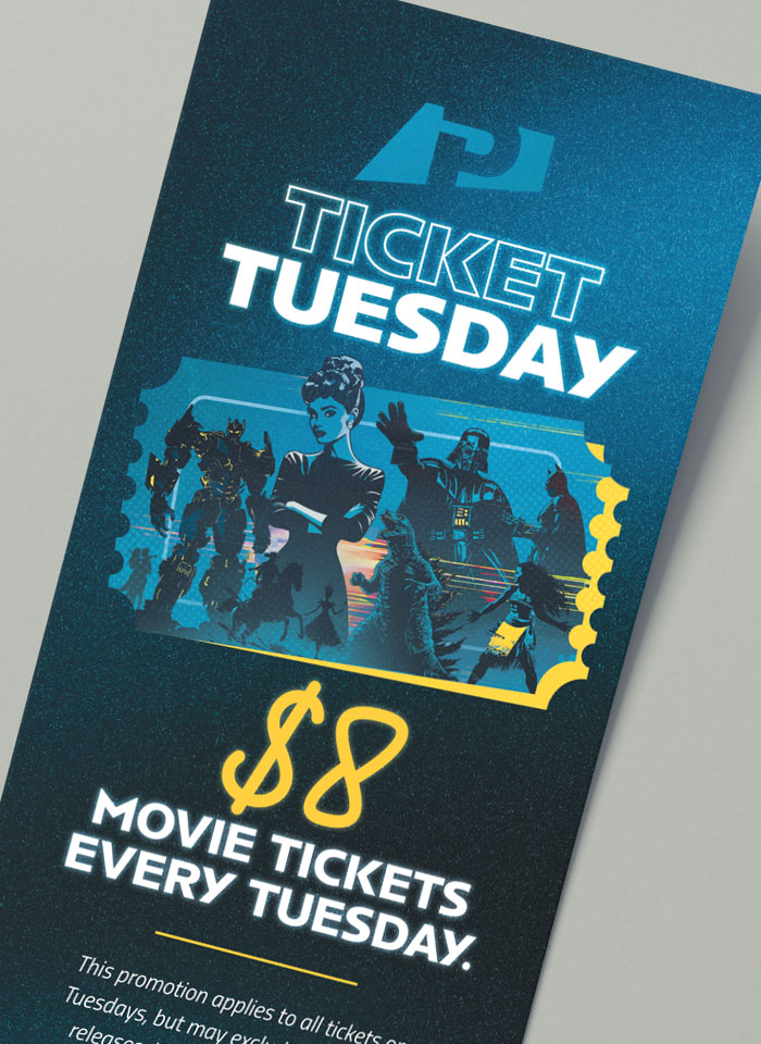
A basic collateral suite developed for use in communication efforts
Getting Started
Penn Cinema came to talk about merchandise. We listened—and it became clear the real work sat upstream. Through our Identity & Experience Map—workshops, candid conversations, and strategy—we helped the team see themselves through a wider lens. The takeaway: their beloved wordmark had equity, but the system around it couldn’t support their direction. We recommended an identity reboot and a toolkit to carry it into every channel with clarity and confidence.
The Challenge
A thriving theater with 2 decades of brand equity and 3 locations sought to elevate the community experience. Yet the legacy reel logo—while loved—wasn’t built to scale. It struggled on tickets, signage, and especially in motion. Change is daunting when the logo is part of the family, but the workshops surfaced a shared truth: the brand system that helped build yesterday’s success was limiting tomorrow’s ambitions. We needed to honor the blue and the recognition—while creating an identity that could move, grow, and perform today and tomorrow.
Our Approach
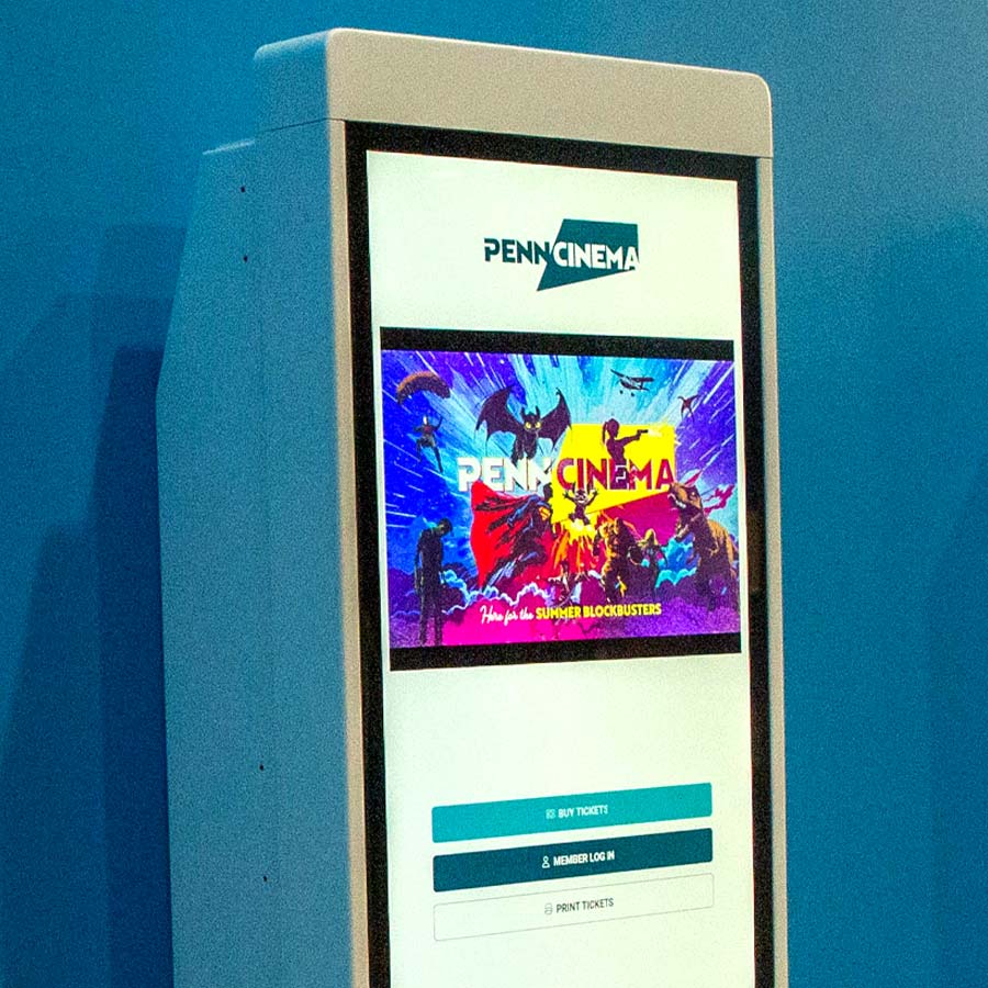
We began with the Identity & Experience Map: a structured circuit of workshops, open conversations, and strategic mapping. It clarified where the brand had been, where it wants to go, and how to get there. From that clarity, we designed a projection-based wordmark—simple, legible, unmistakably Penn—paired with a robust wordmark and motion language. We then built the system: film-themed adaptations, a cinematic policy clip, and comprehensive guidelines for logo variants, color, type, and spacing so the identity is consistent and easy to use.
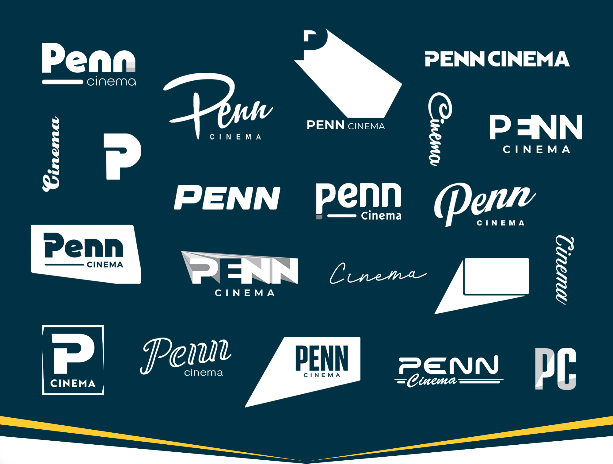
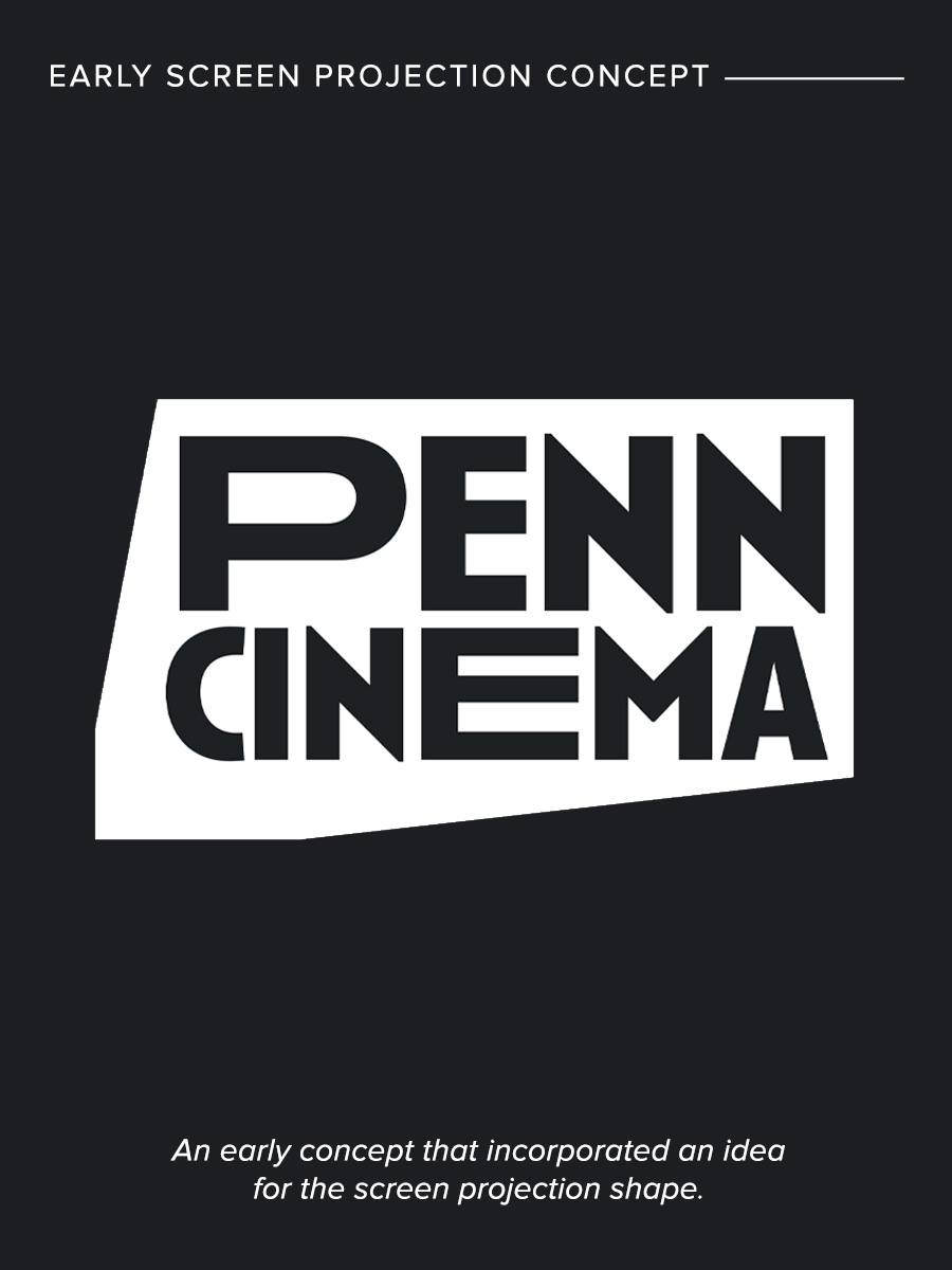
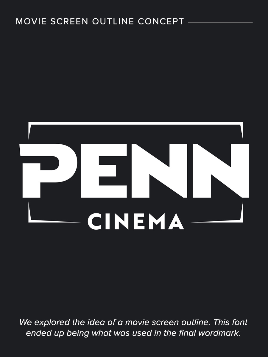
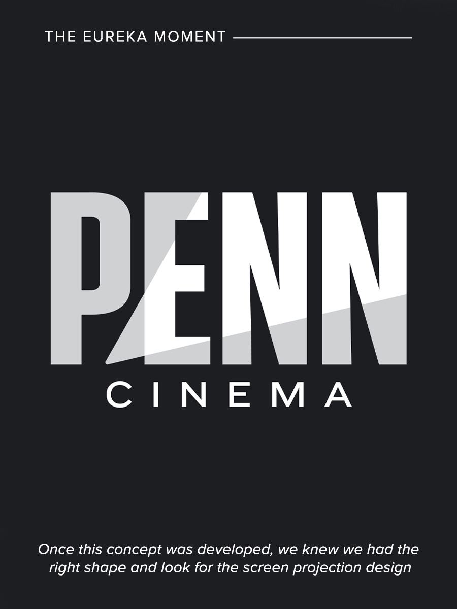
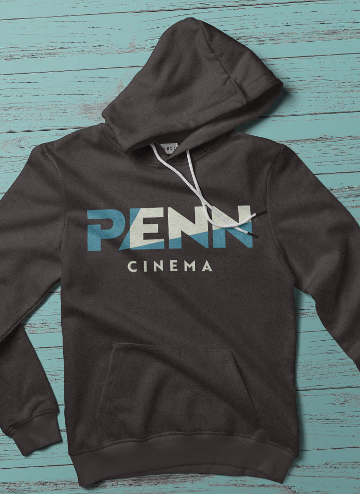
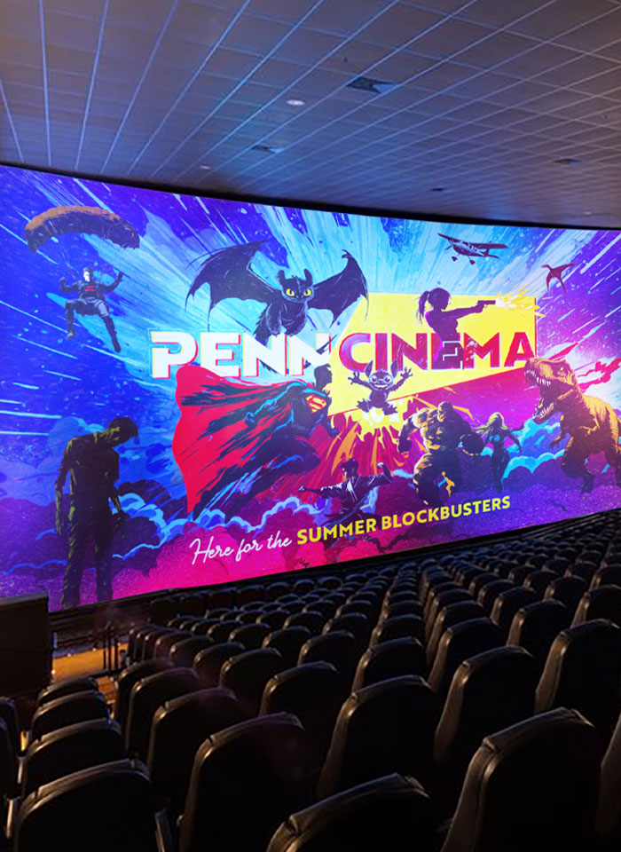
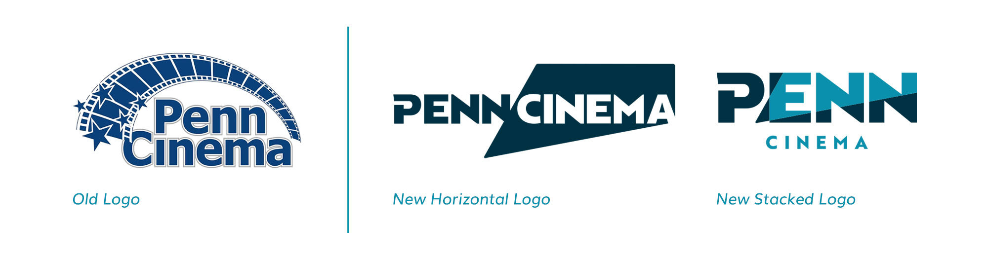
The final wordmark features two variations that are simple, clean, scalable and anchored in the Penn blue colors. The screen projection shape is the key consistent mechanism that is equally strong, yet unique, in both versions as seen below.
toolkit
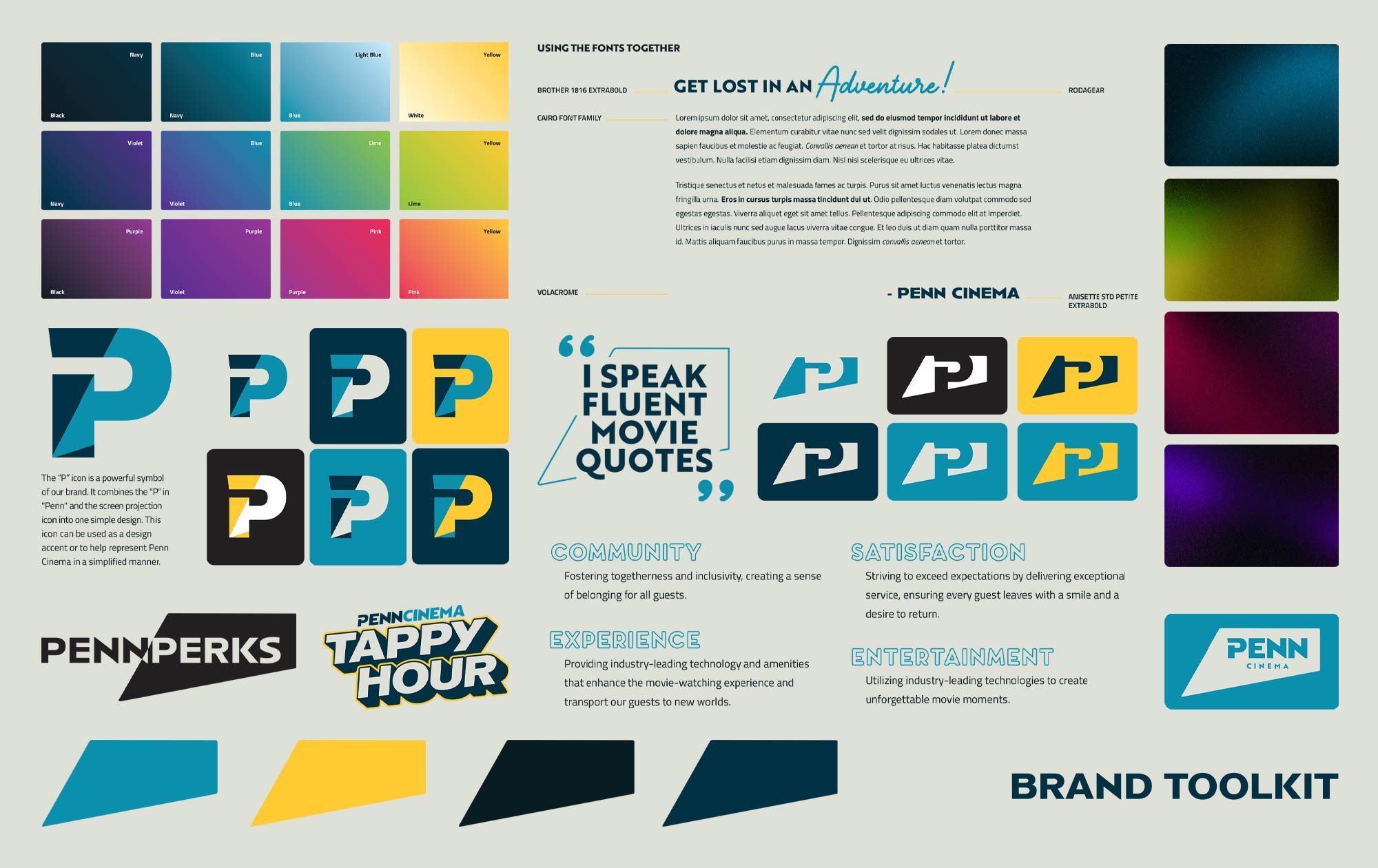
Practical Toolkit
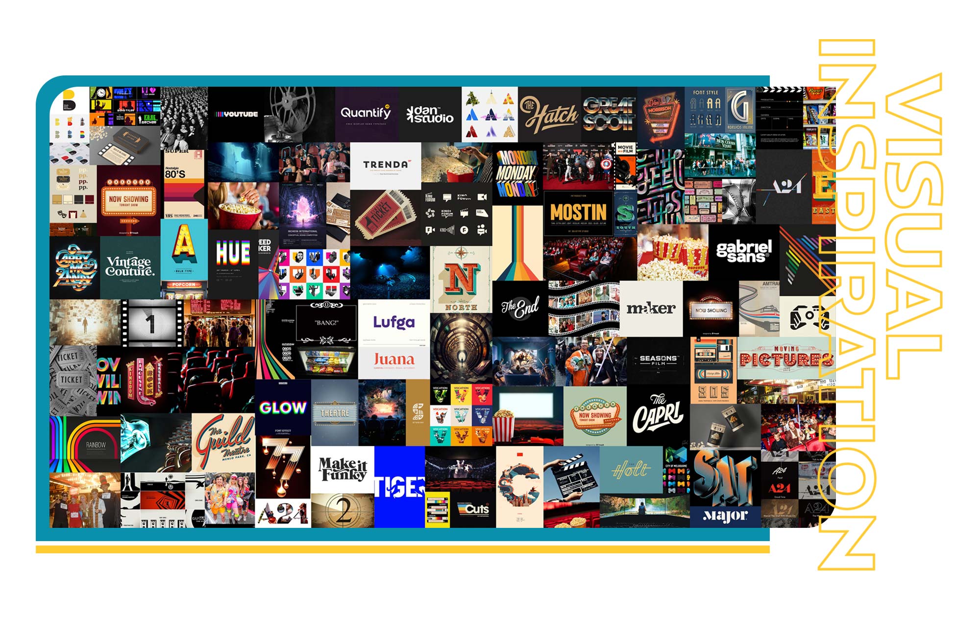
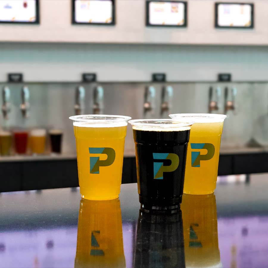
From the very beginning of planning and concepting the Penn brand we had a goal of developing a robust brand toolkit that fit into the cinematic world. The toolkit consists of various color palettes, gradients and textures along with a modern typography family, icon variations and key messaging guidelines.
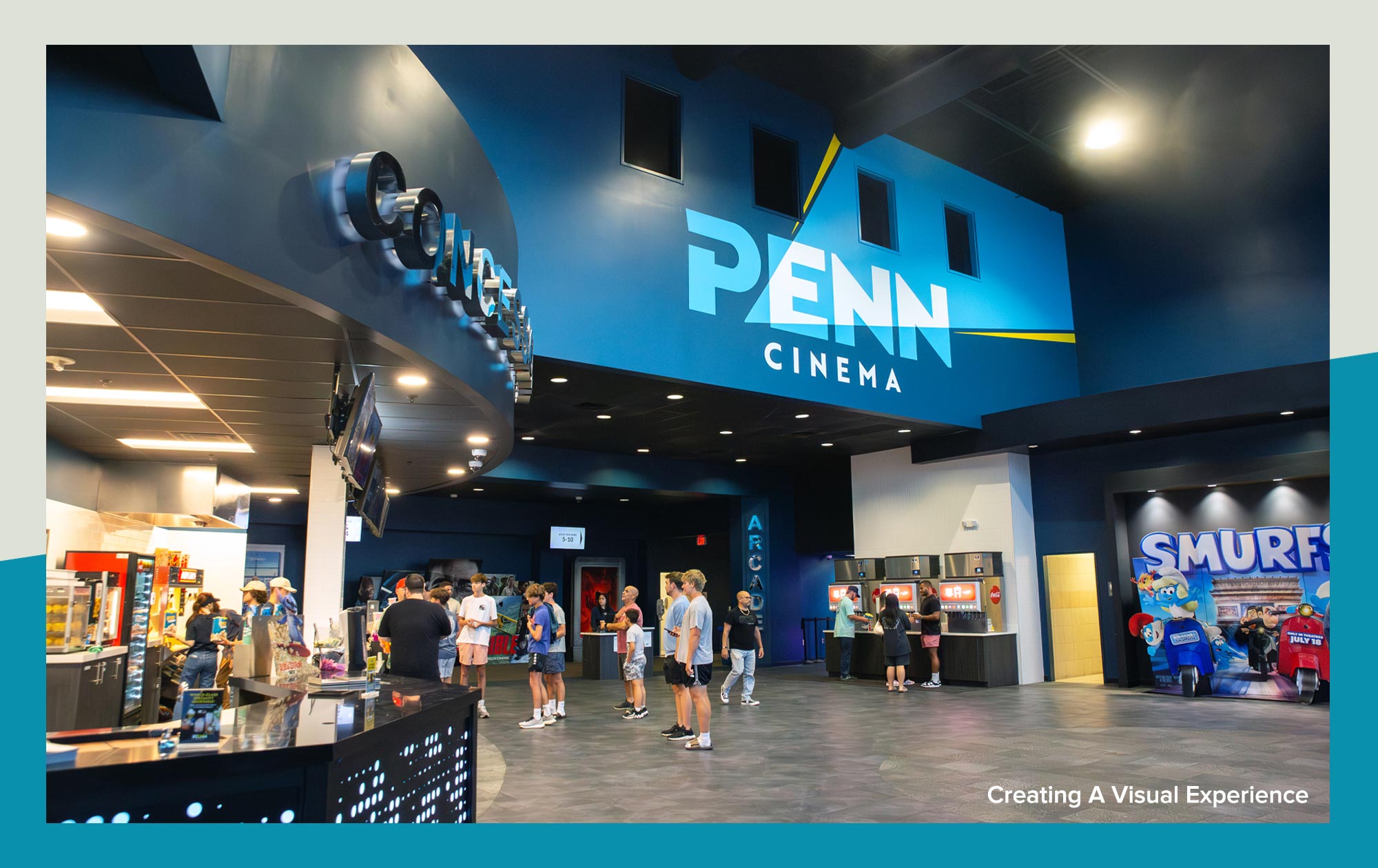
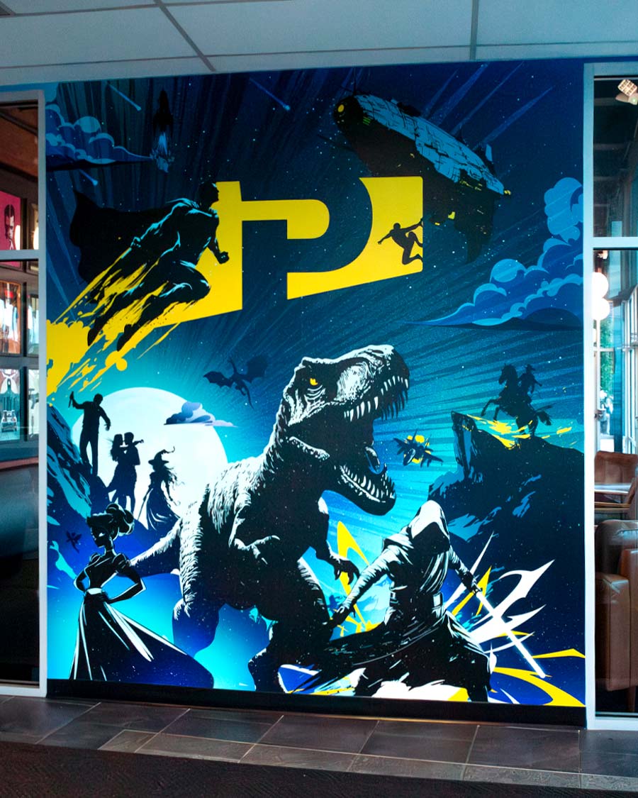
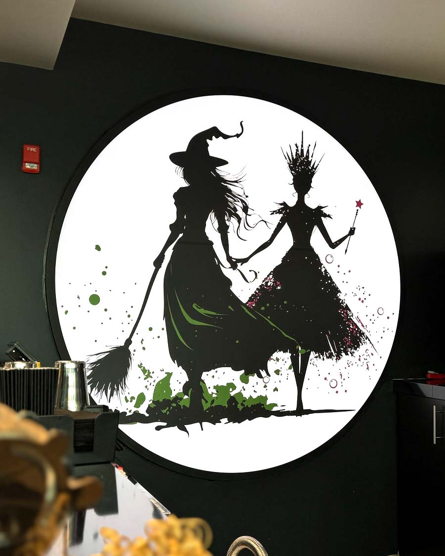
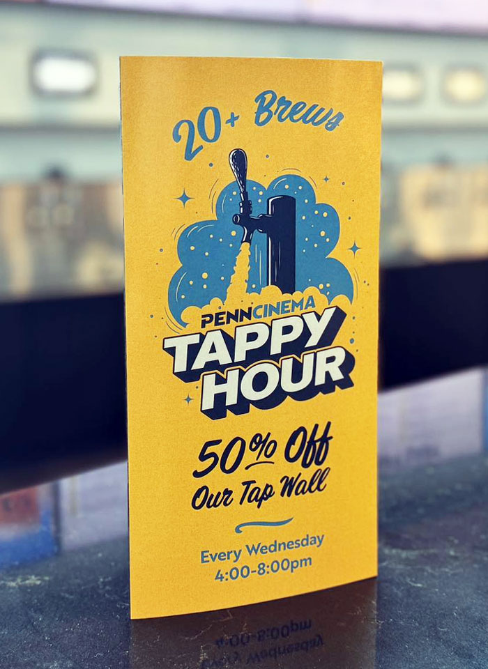
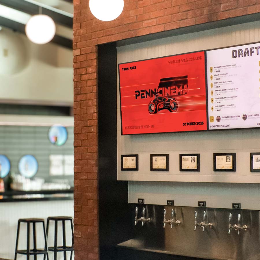
Throughout the newly renovated interior, we strategically created high-impact visuals to grab peoples attention and enhance their overall experience when walking through the vestibule and into the lobby and bar areas.
Bringing the logo to life! What better way to invite people into the theatrical experience. We created a short, impactful theater-ready policy clip that feels like an opening credit, helping to set the tone before every movie.